Responsive Accordion is a component ready to use on mobile devices and desktop devices.
It's a fluid component and easy to use. It provides various skins, options and features for data organization.
Ready for the Bootstrap Framework.
"Responsive Accordion" is fluid and is ready for use in desktops, tablets and mobile devices
Is included 7 skins for different behaviors of "Responsive Accordion". Each skin has his own visual behavior
Support for all major browsers, including touchscreen devices, mobile and desktop devices
You can easily set the delay time and the time of appearance of accordion's content
"Responsive Accordion" supports icons from Font-Awesome. There are over 440 icons available.
"Responsive Accordion" works pretty good with HTML5 and uses jQuery for extensive compatibility
"Responsive Accordion" is compatible with the Bootstrap most recent versions
"Responsive Accordion" is easy to customize, including the skins and color schemes
Updates, bug fixes and improvements without additional cost
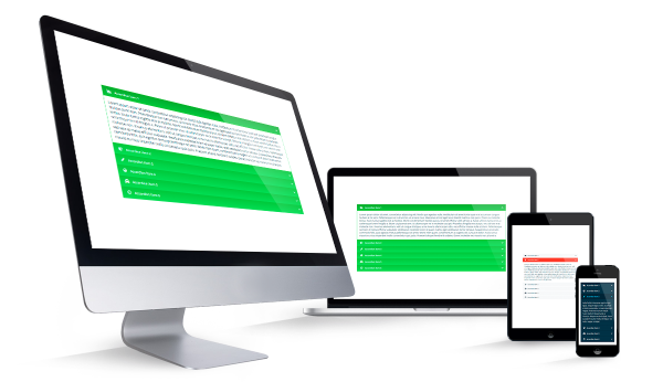
"Responsive Accordion" has been tested on desktop devices, tablets and mobile phones to give you the maximum of compatibility. It's a flexible component that you can use on several devices.
"Responsive Accordion" is compatible with Chrome, Firefox, Safari, Opera and Internet Explorer (IE9+). On mobile devices "Responsive Accordion" is compatible with Safari (Ipad/Iphone), Chrome and Firefox on Android Devices.